Charcoal or Graphite for a First Tonal Sketch?
Charcoal or graphite for a first tonal sketch? Compare their marks, adjustability and working feel to choose a material that suits the image.
The common mistake in choosing charcoal or graphite for a first tonal sketch is to assume that one is simply the easier version of the other. That choice can cost you time spent fighting the mark: graphite tends to build a narrow, controlled range, while charcoal makes broad, dark passages readily. The better starting point is the kind of tone you want to organise.
Charcoal or graphite changes the way tone is built
A tonal sketch describes light and dark before it tries to describe every surface detail. Tone may be the shadow beneath a bowl, the middle value across its side, or the lighter plane facing a window. The material affects how easily you can place these areas and how visibly the drawing records your decisions.
Graphite is a form of carbon mixed with clay and formed into a pencil or stick. A graphite pencil makes a line with a relatively clear edge; changing pressure, pencil grade or stroke direction can gradually deepen it. Its marks often have a slight sheen when pressed hard or layered densely, which can make the darkest area look different from the softer greys around it.
Charcoal is carbon in a more friable form, available as vine or willow charcoal, compressed sticks and charcoal pencils. It can leave a velvety, dry mark that spreads into broad shapes. A soft piece can shift quickly from pale grey to deep black, though the result depends on its form and how it meets the paper.
Neither material owns a particular kind of drawing. A graphite artist can make sweeping, loose marks, and charcoal can be sharpened for fine lines. The difference is the amount of effort each usually asks for when you want to move between a delicate passage and a strong dark.
The mark on the page sets the working rhythm
With graphite, a pencil point supports small adjustments. It is easy to place a contour, add a row of closely spaced strokes, then soften the tone with another layer. This makes graphite congenial when the sketch depends on careful transitions or on keeping a light area clean. The trade-off is that filling a large shadow with pencil strokes can become laborious, and repeated pressure may burnish the paper into a smooth, reflective surface.
Charcoal invites a different pace. The side of a stick can cover a broad area, while its tip can pick out a sharper accent. A kneaded eraser can lift some charcoal back from the surface, making a light mark feel like part of the drawing rather than a blank hole. That responsiveness can encourage bold choices, but loose particles may smudge when a hand passes over them.
Paper matters to both. Smooth paper preserves a crisp graphite line but may offer less tooth for layers to grip. Textured paper catches charcoal unevenly, creating a broken, lively passage; it can also make tiny details harder to keep clear. A mid-textured drawing paper is a flexible place to begin, provided it suits the tool and the intended finish.
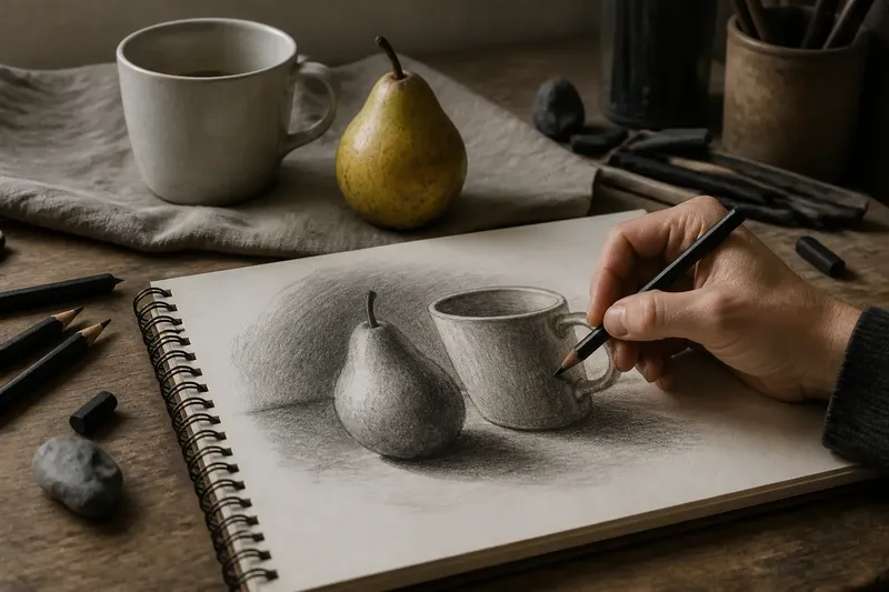
Say you are sketching a pear beside a mug. If the pear’s shadow is the main feature, charcoal can block it in quickly and let you lift a thin highlight along the curve. If the mug’s shape and small changes in its grey surface matter more, graphite may make those measured transitions easier to control. In either case, begin with the largest light and dark areas, then decide whether the material is helping you see the form.
Adjustment is more than erasing a mistake
Graphite usually changes by addition: lighten the pressure, choose a harder pencil, leave a gap, or use an eraser to recover paper. A soft eraser can remove some graphite; a kneaded eraser can dab at a passage without dragging it as much. Yet heavily pressed graphite can be stubborn, and rubbing repeatedly may roughen or polish the paper rather than restoring a clean light.
Charcoal can also be erased, but lifting is often part of the drawing process. Press a kneaded eraser gently into a dark passage and it can pull out a soft glow; reshape it to make a smaller lifted mark. A standard soft eraser may remove more decisively, though it can disturb the paper’s surface. Since charcoal moves readily, the hand’s position matters: rest on a clean sheet or keep the drawing hand away from fresh marks.
Neither medium makes revision effortless. Graphite can accumulate into a dense, shiny layer; charcoal can spread beyond the intended boundary. Rather than trying to erase every uncertain mark, look at whether it changes the larger light-dark structure. A misplaced contour may matter less than a shadow that has become too dark or a light area that has lost its separation.
Choose the material that supports the sketch’s purpose
For a first tonal sketch, graphite is often a comfortable choice if you want a quiet, portable tool and a drawing that develops through small, legible changes. It suits studies in which edges, gradual shading and restrained contrast are central. Start with a middle-grade pencil and a softer one for the darkest accents; avoid pressing hard simply to reach a dark tone.
Charcoal is a strong choice if the subject calls for substantial darks, broad masses or visible, energetic marks. Vine charcoal is generally easier to lighten and rearrange than compressed charcoal, while compressed forms tend to produce richer darks that can be more tenacious. A charcoal pencil offers more control than a stick, though it does not cover an area as quickly.
Using both is possible, but it is not automatically an improvement. Graphite laid down heavily can resist later charcoal, and charcoal dust may muddy a carefully maintained graphite passage. For a first study, choose one material and learn what it does across a small range of marks; combining them becomes more useful once you have a reason for the contrast.
It is not worth buying a large assortment of grades or sticks before you know which surface and mark you prefer. One pencil, one eraser and suitable paper can reveal whether a slower, more controlled build or a broad, liftable tone fits the subject.
Which material suits the question you want to answer?
Is graphite better for beginners?
Graphite can feel more predictable because a pencil point places a clear line and the marks are less prone to accidental smudging. It is not inherently easier, though: dark, broad tones may take patience, and pressure can leave shiny patches.
Is charcoal easier to erase?
Charcoal often lifts well with a kneaded eraser, especially when it has not been pressed firmly into the paper. The result is usually a softened light rather than a perfectly clean surface, so erasing is best treated as another way to shape tone.
Can charcoal and graphite be used together?
Yes, but the order and surface can affect how well they sit together. A light graphite structure with a few charcoal masses may work, while dense graphite can make later charcoal marks uneven; for a first tonal sketch, one medium keeps the material choices easier to read.
What paper should I use for a tonal sketch?
Choose drawing paper with enough texture to hold the material without making fine marks frustrating. Smooth paper tends to favour crisp graphite, while a modest tooth gives charcoal more purchase; follow the paper and material makers’ guidance for compatible use and handling.
Let the first marks reveal what the image needs
Before committing to a full drawing, make a small patch of light, middle and dark on the chosen paper. Try a line, a broad stroke, a softened transition and an erased or lifted passage. This simple comparison makes the material’s behaviour visible: notice whether the dark looks rich or reflective, whether a light can be recovered, and whether the marks support the image you intend.
For a first tonal sketch, charcoal or graphite is less a contest than a choice of working rhythm. Graphite tends to reward gradual construction; charcoal tends to make broad changes feel immediate. Let the subject’s largest tonal relationships guide your decision, then use the material’s particular marks as part of how you see and shape the drawing.