The Edges That Hold a Painting Together
Learn how edges and spacing between shapes guide the eye, steady a painting’s balance and help you decide what to sharpen, soften or leave open.
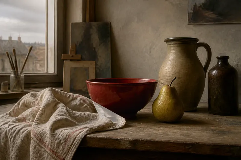
A common mistake in looking at a painting is to follow its most detailed object and overlook the gaps around it. That habit can hide how edges and spacing between shapes organise the whole composition: a crowded corner may feel heavy, while a small open interval can give the eye room to move.
Here, an edge means the visible boundary where one shape meets another or meets the ground. Spacing is the interval between those boundaries. Neither is merely leftover space. A painter can make an edge crisp, blurred, broken or almost invisible, and can make neighbouring shapes press together or drift apart. Those choices affect how quickly we notice a form and where we look next.
Edges and spacing between shapes set the pace
A sharp boundary tends to attract attention because it separates forms decisively. If every boundary is equally sharp, however, the painting can feel cut into pieces. A softened edge lets one form mingle visually with another, while a lost edge allows their values or colours to meet without an obvious dividing line. The eye still reads the shapes, but it must do more of the joining.
Spacing works in a related way. A narrow wedge of background between two objects can become a strong shape of its own. A larger interval may slow the eye or create a sense of separation. These effects depend on the surrounding forms: a thin opening beside a broad, quiet area reads differently from the same opening among several crowded contours.
Think of a still life with a jug beside a pear. If their outlines nearly touch, the small gap may look tense and deliberate. If the pear overlaps the jug, the boundary tells us which form sits in front. If the two silhouettes merge into one dark mass, the viewer may read them as a single shape until a colour change or highlight gives the distinction back.
Look at the gaps before judging the objects
To understand a composition, temporarily treat the objects as plain silhouettes. Notice the shapes made by the spaces between them and by the surrounding ground. These are often called negative shapes: areas that are not the main objects but still have visible outlines and proportions. Comparing them can reveal a tilt, imbalance or crowded passage that is harder to notice while naming each thing.
Try tracing the open spaces with your eyes rather than following the objects. Does a gap widen as it rises? Does a narrow channel lead towards the focal area, or does it point out of the picture? Is one side of the composition held by a compact mass while the other side has scattered forms and open ground? Such questions describe visible relationships, not hidden meanings.
Say you are looking at an invented painting of a red bowl, a folded cloth and a pale tabletop. The cloth’s edge nearly meets the bowl, leaving a slim triangular gap. If that gap points towards the bowl’s rim, the eye may travel along it; if the cloth closes the gap, the two forms may read as one heavier block. The observable difference is in the silhouette and the route your gaze takes, not in a secret message.
A short routine makes the relationships easier to see
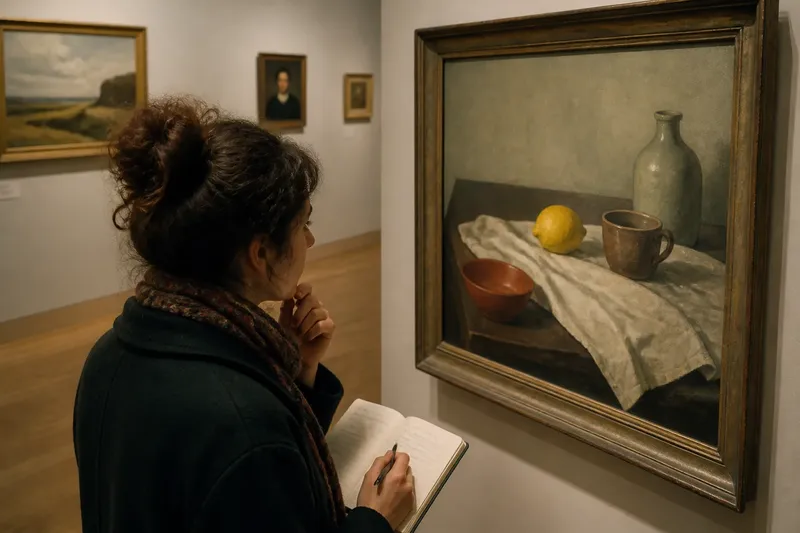
Use a single painting for a week, spending a few minutes with it on different days. A museum visit, a book reproduction or a lawful image on a screen can all work, though a reproduction may alter subtle colour and edge quality. Keep the routine focused on one question at a time rather than trying to analyse every feature at once.
- On the first day, notice where your eye lands first and where it moves next. Name the visible edge or spacing change that seems to direct that movement.
- On the second day, look only at the outer silhouettes of the largest shapes. Notice where they overlap, nearly touch or leave broad openings.
- On the third day, follow the negative shapes. Compare their widths and angles, especially where several small gaps sit close together.
- On the fourth day, find the sharpest boundary and the softest one. Ask what each does to the separation between forms.
- On the fifth day, compare the left and right sides, then the upper and lower areas. Look for differences in crowding and openness rather than assuming the composition should be symmetrical.
- On the sixth day, make a small thumbnail drawing in pencil or felt-tip pen, reducing the painting to a few large light and dark shapes. Preserve the main gaps instead of adding detail.
- On the seventh day, return to the painting and see whether your thumbnail kept its balance. Note which boundary or interval was easiest to overlook.
This sequence gives looking a manageable rhythm: first notice the route, then inspect the shapes that create it. The thumbnail is not meant to copy the painting. It is a way to check whether the composition’s broad spacing remains legible when surface detail falls away.
Balance does not mean equal spacing everywhere
A balanced painting need not distribute forms evenly. A large shape on one side may be answered by a smaller, darker or more sharply edged form elsewhere. Open ground can also counter the visual weight of a dense cluster. The useful question is not whether both halves match, but whether their differences feel related rather than accidental.
Edges help establish that relationship. A crisp contour can make a small shape feel emphatic; a soft boundary can keep a large form from dominating. Likewise, a narrow gap may carry more visual tension than a broad one, especially if it sits between strongly contrasting colours. Look at the whole arrangement before deciding that a space is too tight or too empty.
In your own painting, a brief pause before adjusting an outline can be more useful than polishing it. Compare the gap on either side of the shape, squint to reduce detail, or turn the work upside down to loosen your attachment to the depicted subject. If a change improves the edge but damages a nearby interval, the composition may lose its flow.
Which edge or gap should you attend to first?
Why does a sharp edge attract attention?
A sharp edge makes the separation between adjoining forms clear, so it can become a visual stopping point. It draws more notice when nearby boundaries are softer or less distinct.
What is a negative shape?
A negative shape is an area of ground around or between the main forms. Its outline, width and direction can be studied just like the outline of an object.
Can uneven spacing still feel balanced?
Yes. Uneven intervals can create a lively composition when their visual weight relates across the picture, through size, contrast, colour or edge sharpness.
What is not worth the effort when studying edges?
It is rarely useful to catalogue every tiny contour change before you understand the largest shapes. Begin with the broadest gaps and strongest boundaries; minor details can wait unless they alter the reading of a major form.
Let the space remain part of the painting
When you next look at a painting, include the intervals in your account of what you see. Edges and spacing between shapes can explain why a composition feels crowded, calm or poised without turning that impression into a fixed rule. For an artist, they also offer practical choices: sharpen a boundary to separate forms, soften it to connect them, or preserve an open gap so the eye can breathe before moving on.